

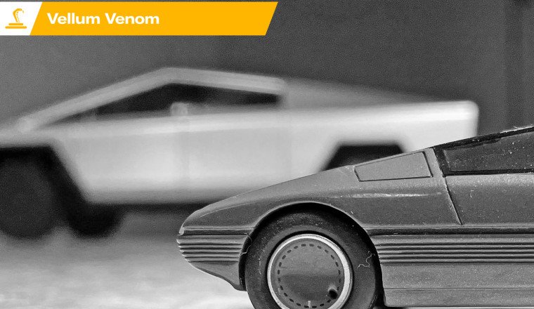
While this series primarily focuses on the design of production vehicles, today we expand on a subject that generated 100,000+ likes, shares, and comments across social media. Apparently, people think there’s a correlation between the radical forms presented in the 1980 Citroën Karin and the 2024 Tesla Cybertruck. That’s a fun notion, so perhaps this is worth a closer look.
History has a bad habit of repeating itself: Both the three-seat concept car from France and the braggadocious American EV pickup possess a strong futurist aesthetic, separated only by decades of technological and societal evolution.
Too bad parking both designs next to each other for a proper Vellum Venom is basically impossible, as one is illegal to drive in the country where the other resides. So I did the next best thing by purchasing both the official 1/18th scale replica of the Cybertruck concept and the 1/43rd scale Citroën Karin by Franstyle.
We discussed the Cybertruck in a previous Vellum Venom, so it’s probably better to focus more on the Karin in comparison. So let’s get to it and run both minimalist wedge designs over the vellum.
The interplay between light and shadow is perhaps the design equivalent of an aptitude test for high school students seeking a college education. But students must master a multiple-choice test with years of learning, while a car body must pass muster when running a light source across its body. The latter shows how and where its surfacing turns light into shadows.
And what happens when the lumens run over the Karin’s wedge body? For starters, the seemingly flat front end turns into a bumper with a gentle “smile” in its surfacing. Move the light further away, and a series of ribs make their presence known below the headlights. Go even further away, and the lower valance shows an extreme level of depth. Note how far back the air dam (i.e. the vertical plane of the lower valance) is relative to the headlights.
Now let’s line up the Karin’s schnoz with that of the controversial Cybertruck. Both possess strong shadows that make it clear a level of surfacing was implemented. Doing so ensures neither is a flat-sided barn. But the Karin uses subtle curves and expert surfacing, while the Cybertruck goes for hard folds, both in the stainless steel front fascia and the charcoal-toned bumper.
Here’s a key takeaway: There is depth and texture to the “not just a pyramid” form of Citroën’s Karin. I propose that the ratio of hard folds to soft surfaces is a crucial element in car design. Too many curves make a body look bubbly, while not enough make it look like…well…a Cybertruck.
The same ratio of hard and soft surfaces applies to the front three-quarter view, as the Karin’s rounded fenders are accentuated by the linear bumper texture that must bend to its will. The Cybertruck continues to fold stainless steel like origami.
But there’s a twist to the story from this vantage point, because the Cybertruck needs a fixed window ahead of the front door to make the radical windshield slope work with the rest of the chassis. Not so with the Karin, as tumblehome and the compact body (with center seating!) means that the milk chocolate body can instead fill in the gap caused by the windshield rake.
Key takeaway: The Karin’s tumblehome gets the lion’s share of the credit, as laying down glass makes that windshield part of a larger pyramid theme. Because it lacks this tapering, the Cybertruck’s aggressively impressive styling is heavily dependent on the observer’s viewing angle for positive feedback.
Let’s go deeper into the concept of tumblehome as applied to the Karin’s uniquely pyramid-shaped greenhouse. Adjusting the light source shows a hard-ish (but not Cybertruck hard) bend right below the greenhouse, one that tapers into the base of the bumper as it reaches the Karin’s front end.
That bend ensures everything below it remains in a shadow, while the stuff above is illuminated. This is a good way to spot tumblehome in a 2-D photograph, and it’s precisely why this pyramid pulls off its radical design better than the Cybertruck. Without tumblehome, the design flops. But the same is true of many vehicles.
Go ahead, look for tumblehome in your favorite antique/classic/specialty vehicle from the last 50-ish years. Now imagine it was gone. Do you still love its styling?
Let’s move to the side view, and remember the key phrase here is proportioning. The Karin embodies the long hood, short deck proportions we’ve come to adore in everything from pre-war Bugattis to the latest Ford Mustang. The passenger cabin is pushed shockingly far behind the front axle, allowing for a generous dash-to-axle, while the Cybertruck has aggressive lines slathered on proportioning akin to a GMT-199 minivan. That is made abundantly clear when sitting inside a Cybertruck, as its massive dashboard is very van-like indeed.
Key takeaway: Cab-forward designs are often less appealing than cab backward designs from the side profile. It’s all about proportioning, however, so a balance must be struck between the needs of the cabin and the rest of the body.
The light and shadow interplay from the Karin’s rear three-quarter view is even more radical than what occurs up front due to the very upright rear fascia. It could be considered as aggressive as the Cybertruck, but the tumblehome and the rounded bumper lines (note the light bleeding on the curve of the rear bumper’s texture) make the Karin far less harsh.
What’s also amazing is how the Karin, designed as a small people mover, has a roofline that’s a cross between an AMC Pacer (especially around the B-pillar in the first photo) and a wedge of cheese.
The Karin is almost an organic shape when paired with the Cybertruck at similar light stages. This is because the Cybertruck’s hard bend below the DLO extends from front to rear in an assertive slash across the body. It dominates the visual conversation this vehicle has with your eyes thanks to very harsh transitions between light and shadow. Such domination can have beauty, at least from a specific angle (or three).
Key takeaway: Some blend of hard and soft contours/creases is almost mandatory to ensure widespread public appeal. From a purely design-oriented perspective, you have die-hard Cybertruck fans, but I reckon the detractors far outnumber them for ample reasons. Throwing in a few curves wouldn’t hurt.
The Karin is a smooth operator, mostly thanks to having a softer transition below the DLO and such a radical amount of tumblehome in the glass. There’s less visual weight for your eyes to fixate on thanks to that tumblehome. The rounded, tapering body contour as it reaches the rocker panel further decreases the burden on your eyeballs.
The Cybertruck does the same with blacked-out paneling at the rockers, but there’s really no substitute for proper surfacing baked into the design from the get-go.
While the Karin is easier on the eyes, both designs are pretty brutal from the back. And both put shock value ahead of functionality. Be it a voluminous hatchback or bed rails with less mass, both designs call for a business end with more business.
Back to styling: Much like the rocker panel discussion, the Karin reduces visual weight and adds texture to the posterior with a heavily surfaced bumper. The bumper possesses linear texture and significant depth, as the bumper sucks inward at its base. That inward push actually takes it back to the rear axle!
And what of the Cybertruck? Trucks need bumpers with steps, so aggressively inward lower elements are unacceptable. The minimalist tailgate is a Suprematist Composition that, thanks to elevated bed rails, looks like a garbage dumpster. This could be eliminated with more surfacing on the tailgate and the implementation of normal bed rails that are parallel to the ground.
Key takeaway: Perhaps it’s easier to be radical and minimal as a hatchback, as pickups must have a conventional bed design to keep the haters away.
Another perk to the Karin’s tumblehome is how and where light reflects, becoming a design element unto itself. With the light source above the roof, the expanses of glass become modern art, and that forces the Citroën logo to come into focus.
Put the light source below the rear bumper, and the radical B-pillar becomes the focus. Between the B-pillars we find a backup camera, living in a color-matched case that gives the roof the feel of an inverted Gambrel barn. (One can imagine how much sleeker the 1980 Karin could be if modern technology were applied in places like this.)
Tumblehome is absolutely imperative to fully realize a minimalist, Modernist, Suprematist, Brutalist, etc. design. To some extent, those fancy design terms are fully interchangeable, at least when you see the Karin from this vantage point.
The Karin gets away with so much tumblehome thanks to its central seating position, ensuring the driver gets the most headroom. (Having never even seen the Karin in the flesh, I can only assume the outboard seats are for children or perhaps short adults.)
But almost as important as tumblehome is how the Karin utilizes different vanishing points for many body parts. Yes, the windshield matches the hood. But that doesn’t match the roof, nor does it gel with the lines generated by hot-wire bending on the rear window.
I could probably write 1,000 words just about this photo, so perhaps let me end with a request: note how far cab-backward the driving position is relative to the front axle. That axle is right below the hood, and it makes the Karin the French equivalent of a C3 Corvette in proportion.
Key takeaway: Proportions, vanishing points, and tumblehome are key to the success of a radical design, more so than a conventional design like a family sedan.
(I would like to apologize for the fact that my homemade light box was too small for this larger die-cast replica, ensuring it was impossible to get a true aerial view.)
In contrast, the cab-forward Cybertruck has a driving position far closer to the front axle. As previously mentioned, this gives the truck a GMT-199 minivan-like position and windshield design. Perhaps the Cybertruck would be a cooler-looking vehicle if it were as cab-forward as your average gasoline-powered pickup?
Back to vanishing points: while the Karin had several shared or unique between and among its body panels, this truck shares them between hood and windshield, and more sharing happens between the bed and the roof. It’s fascinating how one less vanishing point in the Cybertruck ensures the roofline looks like a mountain peak instead of a modest plateau.
Finally, let’s compare the tumblehome. While there is tumblehome in the side glass, it’s masked by less curvature in the roof pillars. The Cybertruck would look more radical/impressive with enough tumblehome to bend the roof pillars inward, but let’s be realistic: Our modern times demand static-looking pillars for rollover integrity and side curtain airbag placement. (But it’s still a shame.)
Key takeaway: Switching to cab-backward proportioning would really help the Cybertruck. But ditching the mountain peak roof with another vanishing point wouldn’t hurt.
From some angles, the aggressive backward thrust of Karin’s windshield pillars (A-pillars) is balanced by the verticality of the rear glass’ hot-wire crease. That upright rear contour aids in cargo carrying capabilities, but it also balances the form in ways the Cybertruck’s shared vanishing points in roof pillars cannot touch.
Key takeaway: The Karin’s roof is far less symmetrical than the Cybertruck, and it’s much better off for it.
Another surface comes to “light” (sorry) from this angle: Note how the hood and the fender are a different shade of brown in the second photo. And note how the top of the fender doesn’t match the side, either.
Key takeaway: This is another example of enlightened use of surfacing, making something that is only inspired by a pyramid.
With all this surfacing in mind, calling the Karin a “pyramid shape” actually does it (and the work of Citroën design boss Trevor Fiore) a severe disservice. There’s an intermediate plane between the front and the sides (i.e., the upper portion of the fender) which adds a delightful amount of complexity.
Then factor in the contoured front end, as seen in the curvature of the two headlight assemblies. Not only are they round, but they are heavily scalloped, with the housing deeply recessed into the “pyramid.”
There’s no intermediate plane in the Cybertruck, ensuring that a “delightful amount of complexity” is impossible to behold (or simply not present). But like any vehicle that demands a modern level of aerodynamics (the Cybertruck has a Cd of 0.38 or 0.34, depending on who you believe), we see a modest curve to the seemingly flat front end.
While there’s no intermediate plane between windshield and fender, there are two that connect the front end to the fenders. It makes a gentle “beak” shape to the Cybertruck, not unlike the singular curve of the Karin.
Ultimately, four items that help enhance the Karin’s design that are either missing or lacking in the Cybertruck:
While the concept Cybertruck photographed here was changed for production (mostly in the headlights, sunken between the front fascia and the bumper), it’s clear that the compelling design of the concept was a mandate for reality.
If only there were such a mandate from Citroën back in 1980. The Karin could have made an amazing commuter for dense urban areas. Paris is certainly beautiful, but it needs Louvre Pyramids sprinkled around its motorways. Talk about a perfect pairing!
Perhaps the wrong vehicle made it to production, but at least one of them did.
Thank you for reading, I hope you have a lovely day.


Facebook Conversations